The way your brick-and-mortar jewelry store’s retail space is planned can define whether you succeed or not.
 |
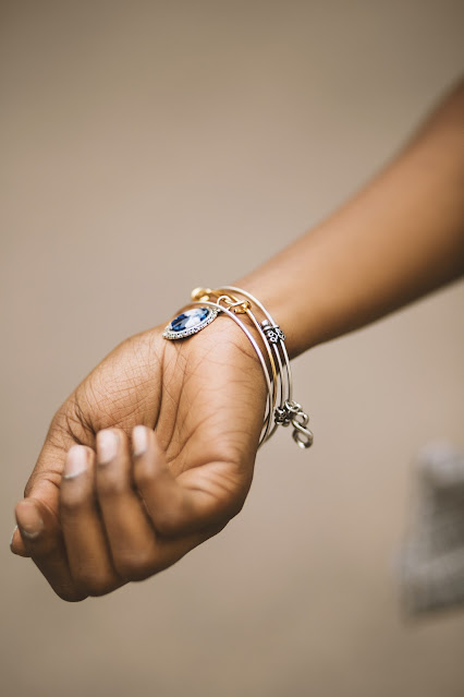
| Photo by Marius Cern on Unsplash |
In this day and age, businesses must always be a step ahead of the competition. Apart from offering great products and excellent customer service, it pays to create a shopping experience that keeps the buyers’ well-being in mind. It’s a win-win situation for all: shoppers are more than likely to buy and return to shops where they had a great time shopping, in turn, this leads to better sales and an improved image for the brand.
Part of creating a jewelry shopping experience that’s worth coming back to can definitely be attributed to having a well-executed merchandise showcase. This happens when both the jewelry display and store layout were designed to ensure that shopping is as stress-free as possible. The kind of retail space that fulfills this has every element involved—the ambiance, store fixtures, staff, and customer interactions—contributing to making that goal a reality.
For now, let’s look at the ways jewelry entrepreneurs can design their jewelry shop that prioritizes customer comfort and preferences which results in better earnings for the business.
Get to know what your target markets desire
Just like when you’re planning for the shop’s product development and marketing campaigns, it pays to focus your attention on your target market’s likes and lifestyle. Attracting them starts with studying what appeals to this particular group so that you can incorporate that into your jewelry shop’s design.
This process becomes a lot easier when you construct a prototypical shopper for your business. Think about their motivations for buying jewelry, then imagine their lifestyle, and the things that are beautiful and interesting to them—this is where it all begins and where you can start shaping your jewelry store’s design. How your shop is laid out, the decorations and furniture you choose, as well as the jewelry display devices you choose (earring display stands, necklace display easels) will stem from your findings.
Showcase the products you want to highlight at eye level
When you want to spotlight a particular merchandise or jewelry display, you would want to always keep them at your customers’ eye level. Again, this will depend on the profile of the typical shopper at your store.
Your secondary products, meanwhile, should be displayed anywhere from the belly button level up to the eyes. You will still be taking into account the shoppers’ comfort this way as they would not have to crouch down to view the products. This is also considered a sweet spot for customers as it’s where their hands and arms would naturally be located when they are stretched out front as they try out rings and bracelets.
Keep a natural flow to the retail space through smart product placement
The last thing anyone would want once they step inside a jewelry shop is a maze, so make sure there’s natural rhythm and flow to how each physical element is laid in the store. Obstructions are a no-no so it’s best to push back your jewelry showcase to the walls. There should also be a mix of jewelry displays where they can try out items but keep the truly high price point items behind glasses.
For the staff assigned on the floor, it’s best for them not to intrude but be always on alert for questions from customers. Once they reach out, it’s best to usher them to a comfy consultation area away from the main retail space area for their privacy.
Choose the best colors that reflect your brand’s identity
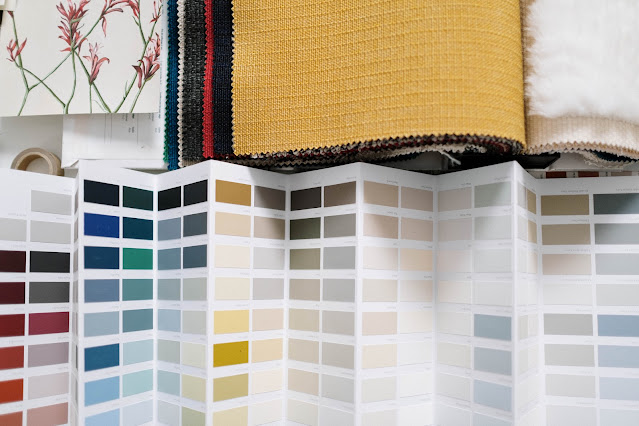
The importance of having a solid brand identity can't be denied. For consumers, it is your business card; the one they associate with your brand the most. It should follow then that your choice of colors for your store’s interior design should also reflect this identity. Nothing could be more jarring if your projected image differs greatly from your establishment’s design, so let’s look at the different cultural traits associated with different colors:
Red: fiery, passionate, energy
Orange: joy, energy, enthusiasm
Yellow: youth, happiness, joy
Green: calm, fresh, nature
Blue: peace, sincerity, authenticity
Violet: nobility, luxury, wisdom
Pink: innocence, sweetness, hope
Black: elegance, mystery, formal
White: purity, peace, cleanliness
We understand that jewelry stores nowadays come in all shapes and forms, catering to different age groups, subcultures, and demographics. As the owner, you will be the best judge on your brand’s imaging and the best person to select the colors to incorporate into our interiors. Your next move should then be to reach out to an interior designer so that your ideas could be fully realized and executed.
Set the right vibes with music and atmospherics
Now let’s look at the non-physical elements that you can incorporate into creating the most conducive environment for your jewelry shop, beginning with music. Your choice of music should reflect your brand’s image as well as the market you’re targetting—as always, both should complement each other. Make sure though that it is not too loud that it becomes distracting and interferes with conversations in the store.
Next, let’s talk about the temperature. Make sure it doesn’t get too hot or too cold that it becomes uncomfortable for all. Scent also helps a lot in mood setting and you can choose to go with aromatics that make the space smell good. As this could easily be a turn-off when overdone, go for diffusers in fresh clean scents like bamboo, cotton, or fresh laundry.
Once everything is combined and executed perfectly, the result would be a physical store that’s unbeatable in its approach to catering to the needs of its customers. And that’s certainly in our book.


0 comments:
Post a Comment