Pantone's Color of the Year for 2022 is a subtly glam hue that offers stunning visuals for your store.
When you want to give your jewelry store interiors and jewelry display concepts a fresh update for the new year, you’ll be pleased to know that Pantone’s Color of the Year for 2022 exudes a striking and alluring vibe that will certainly do wonders for your shop’s atmospherics.
2022 is all about Very Peri, a beautiful mix of blue, violet, and red that “displays a spritely, joyous attitude and dynamic presence that encourages courageous creativity and imaginative expression.” With such a rich tapestry of emotions that the color evokes from the viewer, it certainly makes for a great pick that is sure to inspire artists and content creators.
If you are a shop owner looking for inspiration this year then you simply won’t go wrong with Very Peri as your base color. You may start with these choice color palettes from Pantone that contains the best colors to combine with Very Peri. Now check out some of the jewelry display ideas we came up with inspired by the Pantone palettes that are sure to capture jewelry lovers that come into your shop.
1. The perfect mix of warm and cool tones
Nature-inspired earth tones make for a lovely combination when paired with cooler shades in rose and berry shades. With Very Peri in the mix, the effect is unique, with a down-to-earth romantic vibe. A splash of Pantone’s Color of the Year on the walls makes for a dramatic effect, but the addition of warm tones lends an interesting and at the same time calming appearance to the look.
Go for jewelry display tools in oak to achieve the natural vibes of the palette. To incorporate more of the Very Peri color to your setup, use this as an opportunity to showcase your merchandise that features gemstones in the same color shade (amethyst, jade).
 |
| #WD525OK 5 Pieces Wooden Multi Functions Jewelry Display Stands, Figurine Stand Risers, Oak Color* |
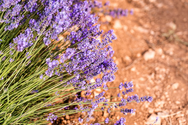
You can then add purple and periwinkle-colored real or artificial flowers to your display to make things more eye-catching to buyers. If you choose to go for real ones (such as some varieties of orchids or lavender), make sure to replace them before they wither.
2. Greenery for new beginnings
Not a fan of florals? You might like this one instead.
It may still be winter but it’s never too early to prepare for spring, and if you want to try out something different this year why not focus on greenery instead of flowers for your jewelry store’s spring season jewelry display? When combined with Very Peri the effect calls to mind the beautiful outdoors such as being in a field of lilac flowers.
The best jewelry pieces to showcase with a predominantly green palette are those made from materials such as wood, shells, polymer clay, and beads. You can also incorporate stands made from natural fiber such as those that come in paper twine or burlap for a truly “back to nature” jewelry display showcase.
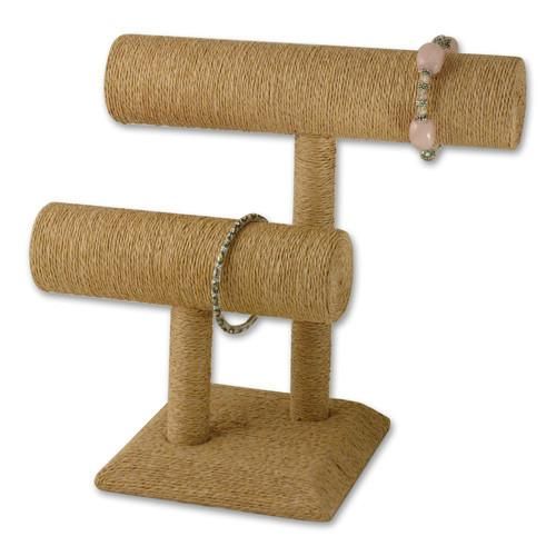 |
| #NDF572 Paper Twine-Wrapped Double T-Bar Bracelet Display* |
3. Neutrality rules
Simple but versatile, basic but never boring, neutrals are truly the go-to colors when you want to exude elegance and classical grace. The equally elegant Very Peri color does add a dash of whimsy to a palette of neutrals which translates to a quiet unique style profile.
You can’t go wrong with a jewelry display stand in gray or black as they are great canvasses especially for making jewelry pieces with even the tiniest details pop. To incorporate the Color of the Year, you can simply add fabric in Very Peri’s shades as an accent.
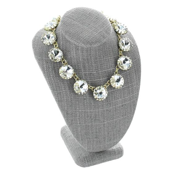 |
| #ND-1896N-N21 Gray Burlap Linen Necklace Display Bust* |
4. A mixed bag of candy-inspired colors
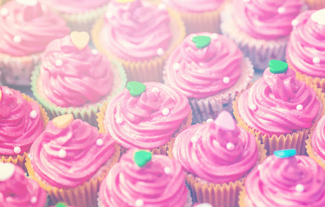
While we are still in the middle of a worldwide health crisis, little wins and simple joys still need to be celebrated. Splashes of color that call to mind childhood favorites such as sweets can certainly bring a little smile to everyone ー which everyone badly needs these days ーso why not bring the concept to your store’s jewelry displays?
Think of the sprinkles on donuts or berry-flavored lollipops if you want to try out this palette. Naturally, your best bet is to go big on color when creating this look. Keep it fun and child-like with props such as balloons and confetti. You can even adopt the theme of desserts and go for a picnic or tea set as your shop’s jewelry display concept.
As for your choice of jewelry to showcase, definitely go for ones that appeal to youthful tastes, such as charm necklaces and bracelets. As for the jewelry display tool, definitely go for ones that have cute and pretty details.
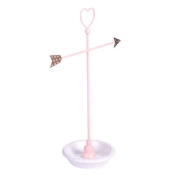 |
| #COP3683 Metal Heart and Arrow Jewelry Organizer Stand* |
Now, Pantone’s Color of the Year is just one of the many style inspirations you can use to create jewelry displays that capture the attention of the buying public. We’re certainly looking forward to the trends that will emerge when it comes to art and design in 2022, and you can be sure that we’ll bring you along for the ride.
*Available on the Nile Corp website.

No comments:
Post a Comment